Responsive Design: Elevating Web Presence for Business Owners and Designers
Forget the idea that a website just needs to look good on a desktop. Your visitors expect smooth, mobile-friendly browsing that feels natural on any device. Responsive design isn’t just a trend—it’s the key to improving user experience and keeping people engaged. If you’re in Indianapolis and want your web design to stand out, understanding these principles will change how your audience interacts with your site.
Understanding Responsive Web Design

The Foundation of Modern Web Presence
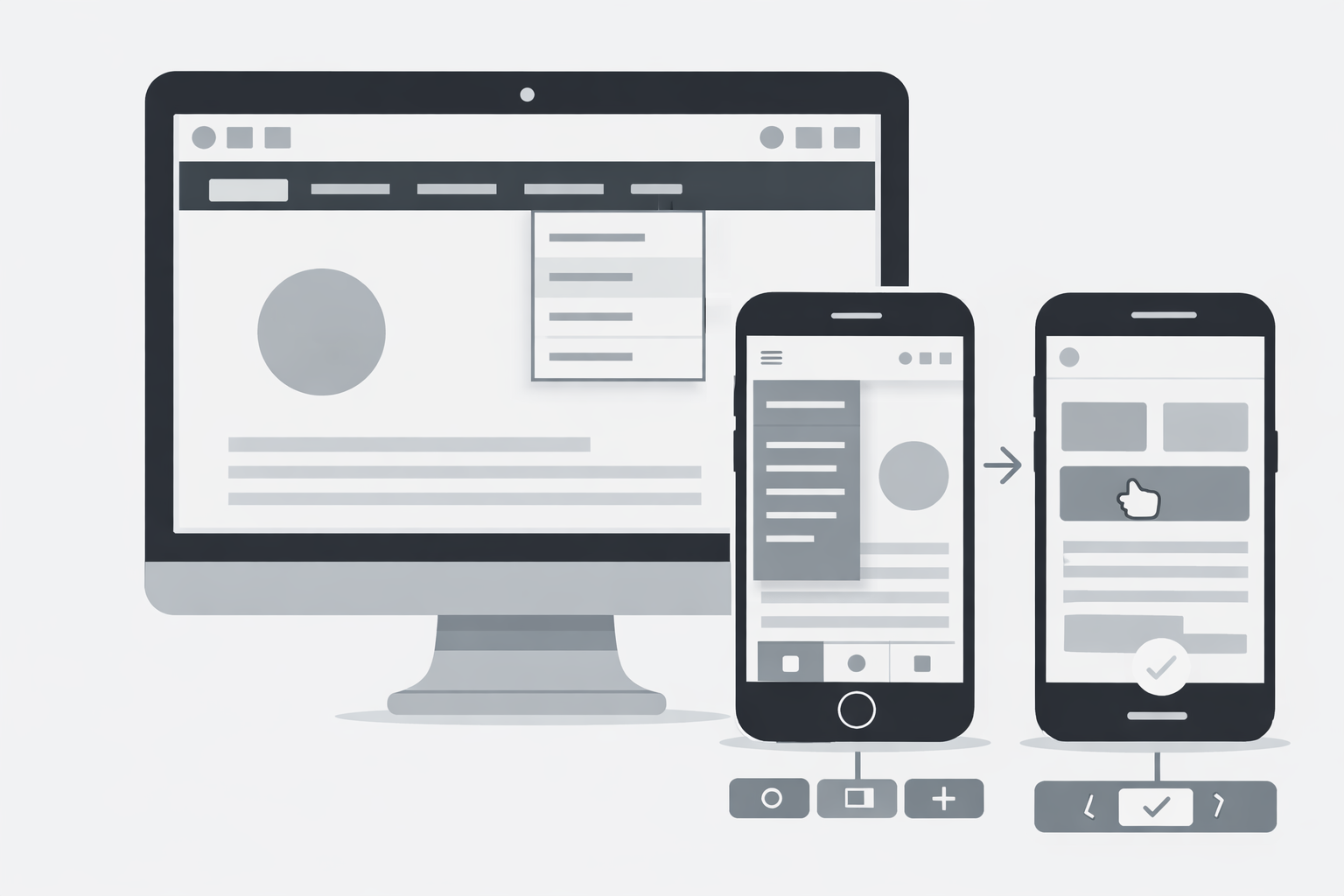
Responsive web design represents an approach to site creation that makes web pages render well across various devices and window or screen sizes. As mobile internet usage surpasses desktop, having a responsive website has become essential rather than optional for businesses in Indianapolis and beyond.
Why Mobile-Friendly Matters
Statistics show that over 60% of web traffic comes from mobile devices. A site that fails to adapt to smaller screens will frustrate users, resulting in higher bounce rates and lost conversions. Google also prioritizes mobile-friendly websites in search rankings, making responsive design a critical SEO factor.
Core Elements of Responsive Design
Fluid Grid Layouts
Unlike fixed layouts that use exact pixel measurements, fluid grids use relative units like percentages. This allows content to resize proportionally to the screen, maintaining visual harmony across devices.
Flexible Images
Images that scale with the containing element prevent overflow issues on smaller screens. Techniques such as setting max-width: 100% ensure pictures look appropriate on any device without manual resizing.
Media Queries
These CSS techniques allow designers to apply different styles based on device characteristics. For example, a three-column layout on desktop might collapse to a single column on mobile, improving readability and navigation.
Business Benefits of Responsive Design
Expanded Market Reach
With responsive design, your Indianapolis business can effectively connect with users regardless of their preferred device. This expanded reach translates directly to greater market potential and customer acquisition opportunities.
Cost-Effective Development
Maintaining separate mobile and desktop sites doubles development and maintenance costs. A responsive approach creates one site that works everywhere, reducing expenses while improving consistency.
Improved Conversion Rates
Studies consistently show that users are more likely to purchase from sites that offer strong mobile experiences. Responsive design creates the smooth, intuitive interface that leads to higher conversion rates.
Implementing Responsive Design
Mobile-First Approach
Starting design from the mobile perspective forces prioritization of essential content and features. This approach results in faster, more focused websites that expand gracefully to larger screens.
Testing Across Devices
Comprehensive testing on various devices ensures consistent performance. Indianapolis web design professionals should verify functionality on popular phones, tablets, and desktop configurations.
Performance Optimization
Responsive sites must load quickly on mobile networks. Techniques like image compression, code minification, and browser caching help maintain speed without sacrificing visual quality.
Navigation for Responsive Sites
Hamburger Menus and Beyond
The familiar three-line menu icon has become standard for mobile navigation, but alternatives like bottom navigation bars or progressive disclosure can offer improved user experience in specific contexts.
Touch-Friendly Elements
Buttons and interactive elements must be sized appropriately for touch interaction. The recommended minimum touch target size is 44×44 pixels to prevent frustrating tap errors.
Simplified User Journeys
Mobile users often have different goals than desktop users. Responsive design should consider these differences, prioritizing common mobile tasks with clear paths to completion.
Typography in Responsive Design
Scalable Text
Font sizes should adapt to screen dimensions while maintaining readability. Relative units like em, rem, and viewport units allow text to scale proportionally across devices.
Line Length Control
Reading comfort depends partly on line length. Responsive designs should maintain approximately 45-75 characters per line across devices for optimal readability.
Hierarchy Preservation
Visual hierarchy must remain clear as screens change size. Maintaining proportional relationships between headings and body text preserves information structure and guides users through content.
Images and Media Handling
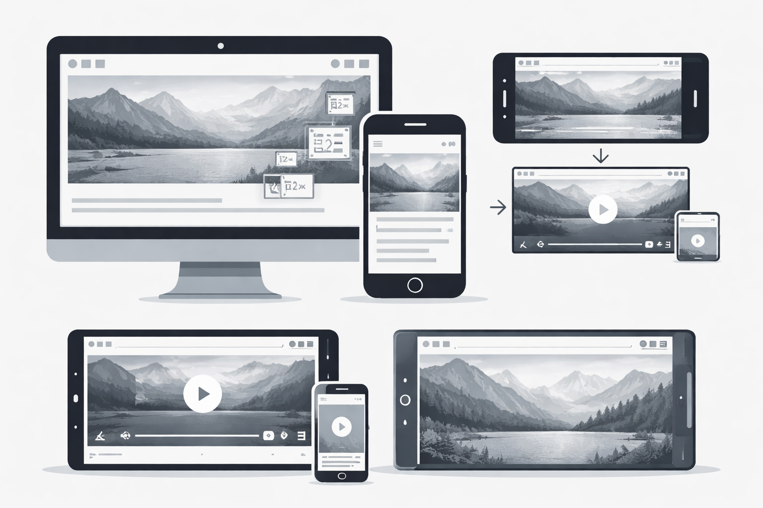
Responsive Image Techniques
Modern HTML offers tools like srcset and sizes attributes to serve different image versions based on screen size and resolution, improving load times while maintaining visual quality.
Video Integration
Embedded videos should resize with their containers and offer appropriate controls for touch interfaces. Proper implementation prevents layout disruption when media is included.
Background Images
CSS techniques allow background images to adapt to different screen sizes through properties like background-size, creating visual interest without fixed dimensions.
Local Impact for Indianapolis Businesses
Meeting Customer Expectations
Indianapolis consumers expect the same quality web experience as users anywhere else. Local businesses must meet these expectations to stay competitive in both local and broader markets.
Standing Out in Local Search
Google prioritizes responsive sites in local search results. For Indianapolis businesses, this can mean the difference between appearing at the top of “near me” searches or being buried in results.
Building Brand Credibility
A professional, responsive website signals to potential customers that your Indianapolis business is current, customer-focused, and attentive to details. This perception extends to assumptions about your products and services.
Future-Proofing Your Web Design
Preparing for New Devices
The device landscape continues to evolve with foldable phones, wearables, and other form factors. Truly responsive design anticipates these changes with flexible approaches rather than fixed solutions.
Progressive Web Apps
Combining responsive design with PWA technology creates sites that function more like native applications, offering offline capabilities and improved performance for Indianapolis businesses seeking competitive advantages.
Accessibility Integration
Responsive design and accessibility share many goals. Building sites that adapt to different needs, whether device-based or user-based, creates more inclusive web experiences.
Finding the Right Indianapolis Web Design Partner
Evaluating Portfolio Responsiveness
When selecting a web design partner in Indianapolis, examine their portfolio on multiple devices. A truly skilled team will demonstrate consistent quality across all screen sizes.
Understanding Their Process
Quality responsive design requires planning and testing throughout development. Partners should explain their approach to ensuring mobile-friendly results from concept to launch.
Ongoing Support Capabilities
Websites require maintenance as devices, browsers, and standards evolve. Choose Indianapolis partners who offer support plans to keep your responsive site functioning optimally over time.