
Empower your business with expert digital strategies, seamless IT solutions, and robust cybersecurity.
What we offer
Elevated Marketing stands as a team of dedicated digital strategists, SEO experts, cybersecurity professionals, and marketers. With decades of collective experience, we transform businesses for long-term success.
Local services for Indianapolis businesses.
We are an Indianapolis digital marketing agency, and these are the local services our neighbors hire us for most.
Contact us today for a quote
Elevated Marketing: your partner in digital excellence.
Unlock your brand's full potential with Elevated Marketing.
At Elevated Marketing, we believe that every brand has a unique story waiting to be told. Our creative strategies and captivating visuals will help you connect with your audience like never before. We combine marketing expertise with the engineering to back it up: the same team that writes your campaigns runs the servers, tunes the rankings, and watches the monitoring.
Work showcase
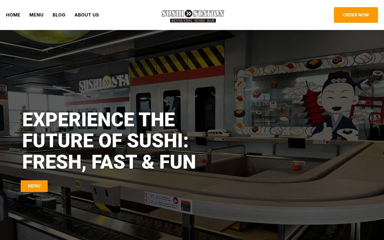

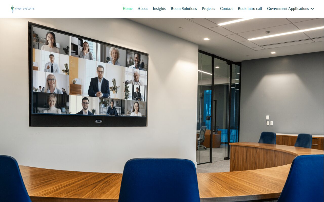

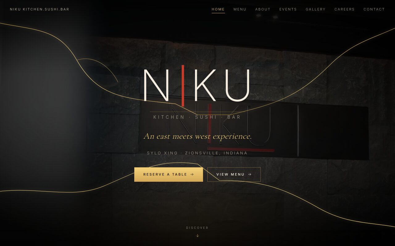
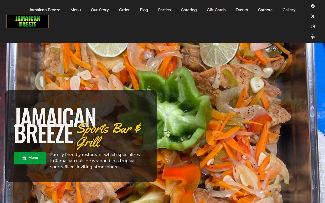
Happy Elevated Marketing customers
The new sites and online ordering made an immediate difference. More people find us on Google every month, and both restaurants have grown steadily since launch.
Since the SEO work started, we get found by homeowners we never reached before. The phone rings more and the leads are better.
Our web presence finally matches the quality of our work. Calls and quote requests from search have picked up noticeably.
They rebuilt our site and locked it down properly. Traffic went up right after launch and it has been rock solid since.
They keep both of my businesses visible online and fix issues before I even notice them. Orders and bookings keep climbing.
The site not only looks great, but it loads quickly and reflects our brand's style. Within just a few weeks, more people are finding us online, and inquiries are up significantly. What's been most valuable is how proactive the Elevated Marketing team is: always watching, always improving. It feels like having an internal marketing partner without the overhead.

Why you should choose Elevated Marketing?
Our expertise spans various fields including SEO services, web development, cybersecurity, IT infrastructure, datacenter management, marketing strategies, and AI integration. We are committed to driving growth and enhancing engagement through innovative digital solutions, and we prove it with numbers you can verify in your own Search Console and analytics.
- Personal connection
- Dedicated support
- Decades of experience
- Results driven focus
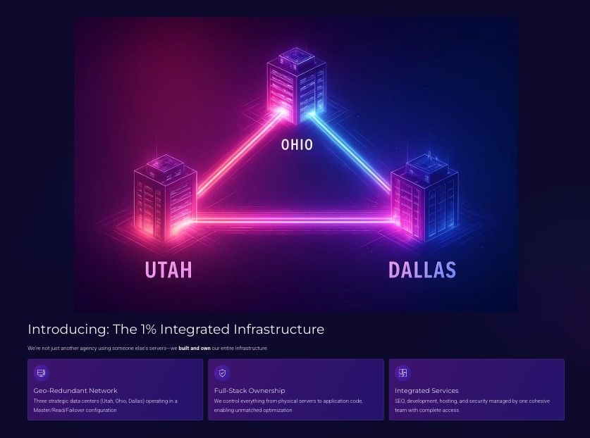
The 99% vs. The 1%:
a clear choice
Most digital agencies operate in a fragmented silo: rented hosting, disconnected tools, reactive support. We built the E.L.E.V.A.T.E. platform on infrastructure we own across three geo-redundant US data centers, so your marketing, hosting, and security run as one system with 24/7 visibility.
| Feature | Standard agency (99%) | Our model (1%) |
|---|---|---|
| Hosting infrastructure | Renting space in a shared apartment building | Owning a secure, private estate with multiple properties |
| Strategy & insight | Flying blind with disconnected, reactive tools | Unified view from our proactive E.L.E.V.A.T.E. AI platform |
| Security approach | Basic locks that everyone else uses | Custom-built fortress with multiple defense systems |
| Support model | Calling the landlord when something breaks | 24/7 monitoring team preventing problems before they happen |
Our proprietary platform unifies all your critical marketing data in one mission control center.
24/7 proactive monitoring of SEO performance, website stability, and security threats.
Built on our own geo-redundant data centers with a 99.99% uptime SLA.
We are ready to elevate your business
Our team members
Ken Floyd
Co-Founder · Marketing · Head of Sales
Marketing, sales, and photography lead. Ken has grown brands across multiple industries with social strategy and content that actually engages.
Isaac Maple
Co-Founder · Cybersecurity · Head of IT & SEO
Security and IT specialist with Fortune 100 experience. Isaac hardens client sites against real threats while tuning servers for speed and rankings.
Irina Lozova
Project & Public Relations Manager
Project management and PR. Irina keeps every engagement on schedule and every stakeholder informed, from kickoff to launch and beyond.
Alex Lechuga
Photography & Visual Media
Staff photographer and Emmy Award winner for food photography. Broadcast-level craft behind every shoot we deliver, from menus to full brand campaigns.
Sasha Lozovaya
Web Design · Social · Cybersecurity
Developer covering web design, social media, and security, turning the team's strategy into shipped, secured, working sites and campaigns.
How we elevate your brand
Every SEO engagement starts with a 28-day baseline from your own Google Search Console. We fix what is measurably broken, then build content the data says you can win.
Crawl health, page speed, structured data, and canonical hygiene cap everything else. Our engineering background means we fix these at the server, not around it.
GEO is included in every plan: llms.txt, AI-crawler policy, and entity-clean schema so ChatGPT, Claude, and Google AI Overviews recommend you correctly.

Elevate your brand with innovative marketing strategies designed to maximize engagement and drive growth across multiple industries.
From captivating visual content to compelling storytelling, our marketing team delivers results that build brand awareness and foster customer loyalty.
Real photos of your real work, shot by a team that includes Emmy Award winner Alex Lechuga. Authentic visuals consistently outperform stock imagery for trust and conversion.

Every site we build and host ships with platform hardening, a web application firewall, and origin protection. Security is not an upsell, it is the baseline.
File integrity, uptime, and login monitoring on our own dashboards, 24/7, with humans who can act, not just log.
Our sister company brings Fortune 100 security experience to small-business websites, because attackers do not check your company size.

News & articles


Unlock your online potential today!
Get a straight assessment of your website, rankings, and security posture, free.